#Next.js#Tailwind CSS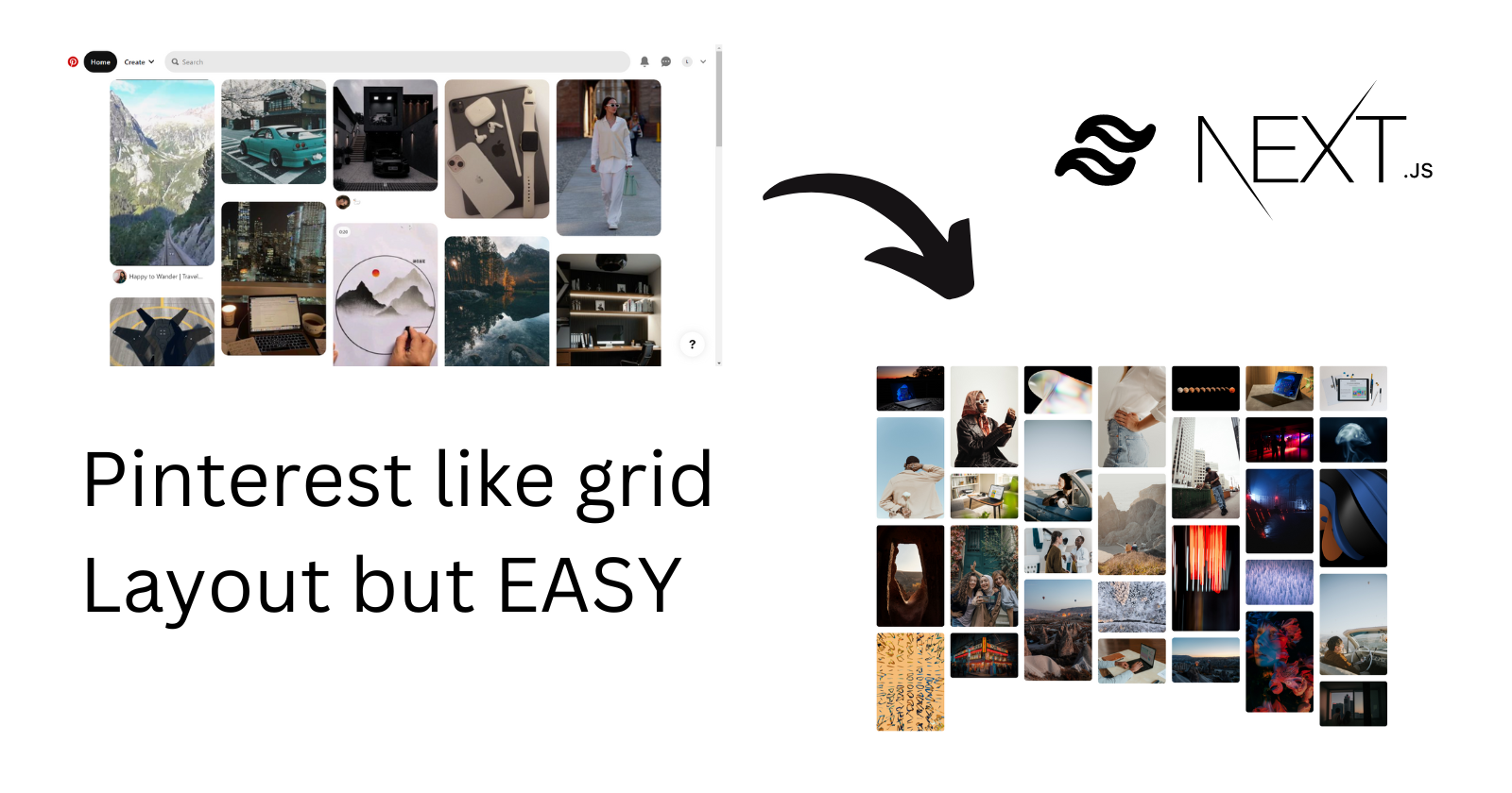
Pinterest Masonry Grid Layout with Tailwind CSS & Unsplash API
Hey guys, Today we are going to be making Pinterest's masonry grid layout of their home feed. We will be using Next.JS & tailwind CSS with Unsplash API for this project.
First, let's have a look at what we're going to be building.
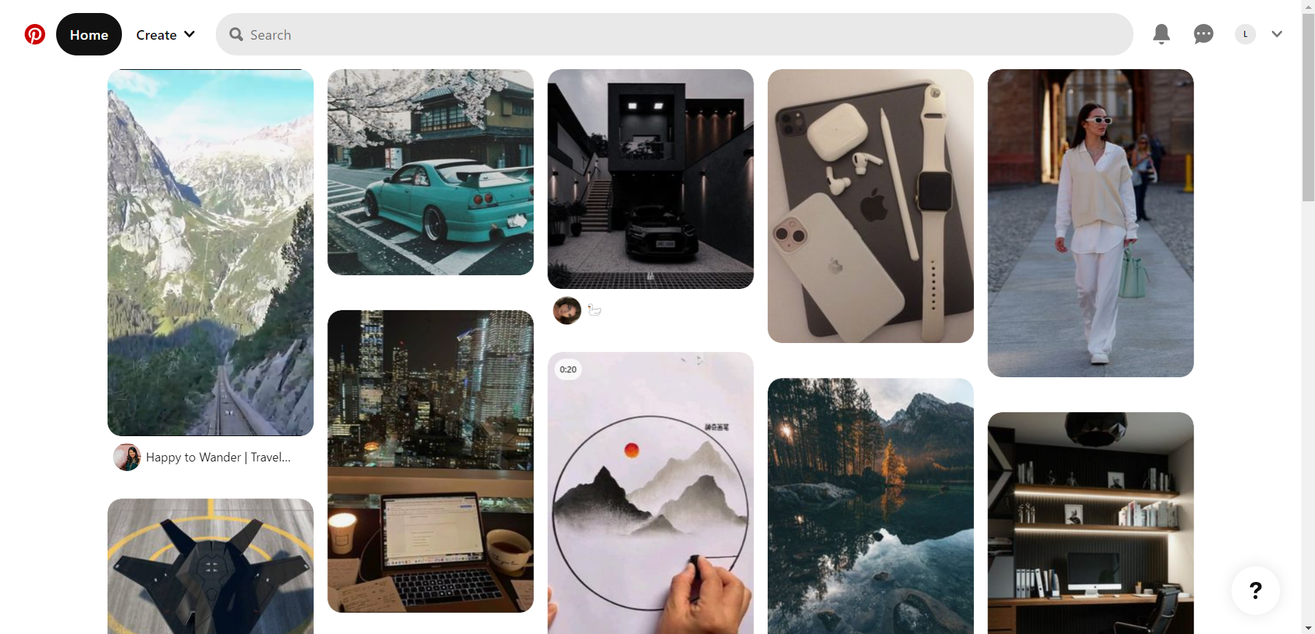
Here's what the home feed of Pinterest looks like
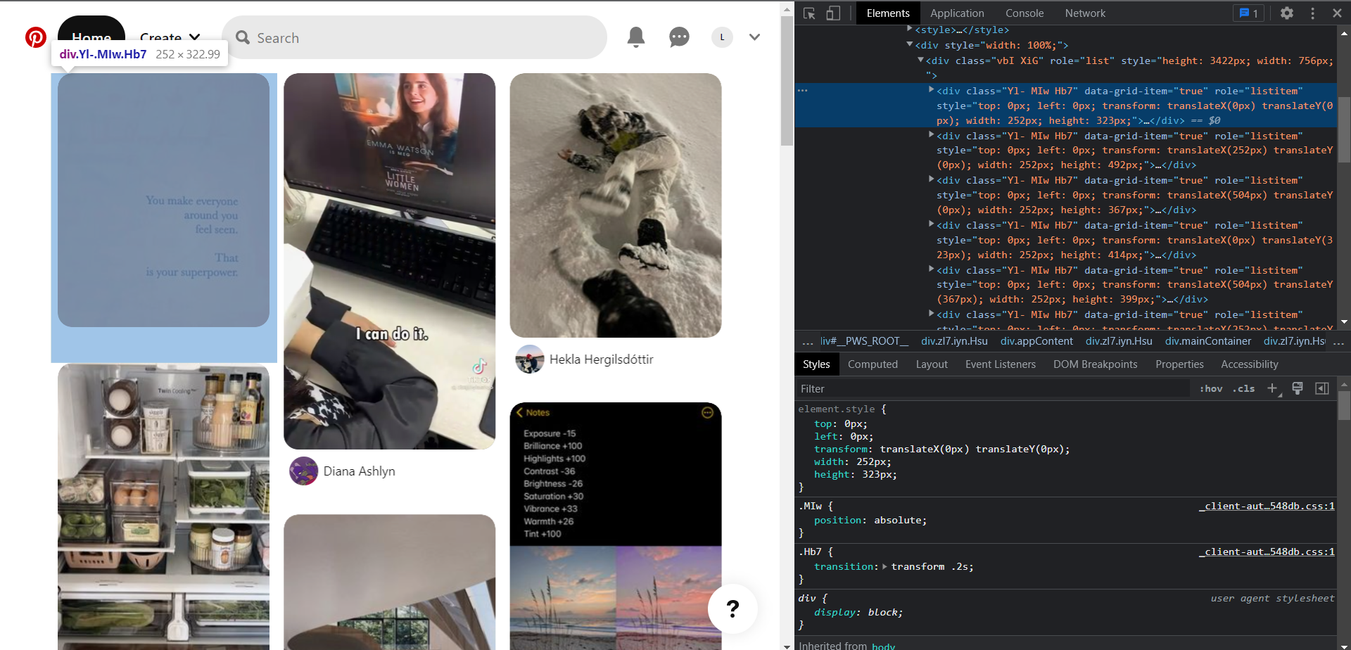
Upon inspecting with Chrome Devtools, We can see that they have implemented the layout using translate and absolute position, etc. for their layout.
But we are going to be implementing the same layout in a much simpler way, using Columns. Columns is a CSS shorthand for column count & column width property. I first saw this in the tailwind docs as class and later realized that it's a CSS property. So, what this property does is it helps in dividing an element into columns that you specify. Kinda like the columns in a newspaper article.
You can checkout the tailwind docs for columns here.
Let's go ahead and get access to Unsplash API. Go to Unsplash developer , register your application & you will be able to get access & secret key for that project.
Now let's use create-next-app to create a next.js application for us.
npx create-next-app pinterest-layout
Let's install our dependencies for this project. First, Tailwind CSS.
npm install -D tailwindcss postcss autoprefixer
npx tailwindcss init -p
After running the two commands, your root directory shall now have a tailwind.config.js file.
In that file remove all existing code & add the following snippet:
/** @type {import('tailwindcss').Config} */
module.exports = {
  content: [
    "./pages/**/*.{js,ts,jsx,tsx}",
    "./components/**/*.{js,ts,jsx,tsx}",
  ],
  theme: {
    extend: {},
  },
  plugins: [],
};
Now under /styles/globals.css. Remove all existing code & add the following snippet:
@tailwind base;
@tailwind components;
@tailwind utilities;
Now, Let's go to /pages/index.js now. We will remove all the existing code and add the following snippet:
import Head from "next/head"
const Home = () => {
  return <>
    <Head>
        <title>Pinterest</title>
    </Head>
  </>;
};
export default Home;
Now with this much done, we can start to set up our unsplash api, first create a .env.local file in your root directory.
Add in your access key provided in the Unsplash developer portal.
Now let's install the Unsplash library
npm i unsplash-js
After that let's initialize the instance to make request to unsplash api as said in their docs.
We will be using getServerSideProps to make request from our server to the unsplash server & we will return the response as props to the page.
import { createApi } from "unsplash-js";
export const getServerSideProps = async () => {
const serverApi = createApi({
accessKey: process.env.ACCESS_KEY,
});
const photos = await serverApi.photos.list({perPage: 30});
return {
props: {
photos: photos.response.results,
},
};
};
Now if everything goes well till here, then we will get photos props in our page and we will be able to access it via props.
Now lets map over the photos prop.
const Home = ({ photos }) => {
  return (
    <>
      <Head>
        <title>Pinterest</title>
      </Head>
      <section>
             {photos.map((el) => (
                <div key={el.id}>
                  <img
                    src={el.urls.regular}
                    alt={el.description}
                    height={300}
                    width={200}
                  />
                </div>
              ))}
      </section>
    </>
  );
};
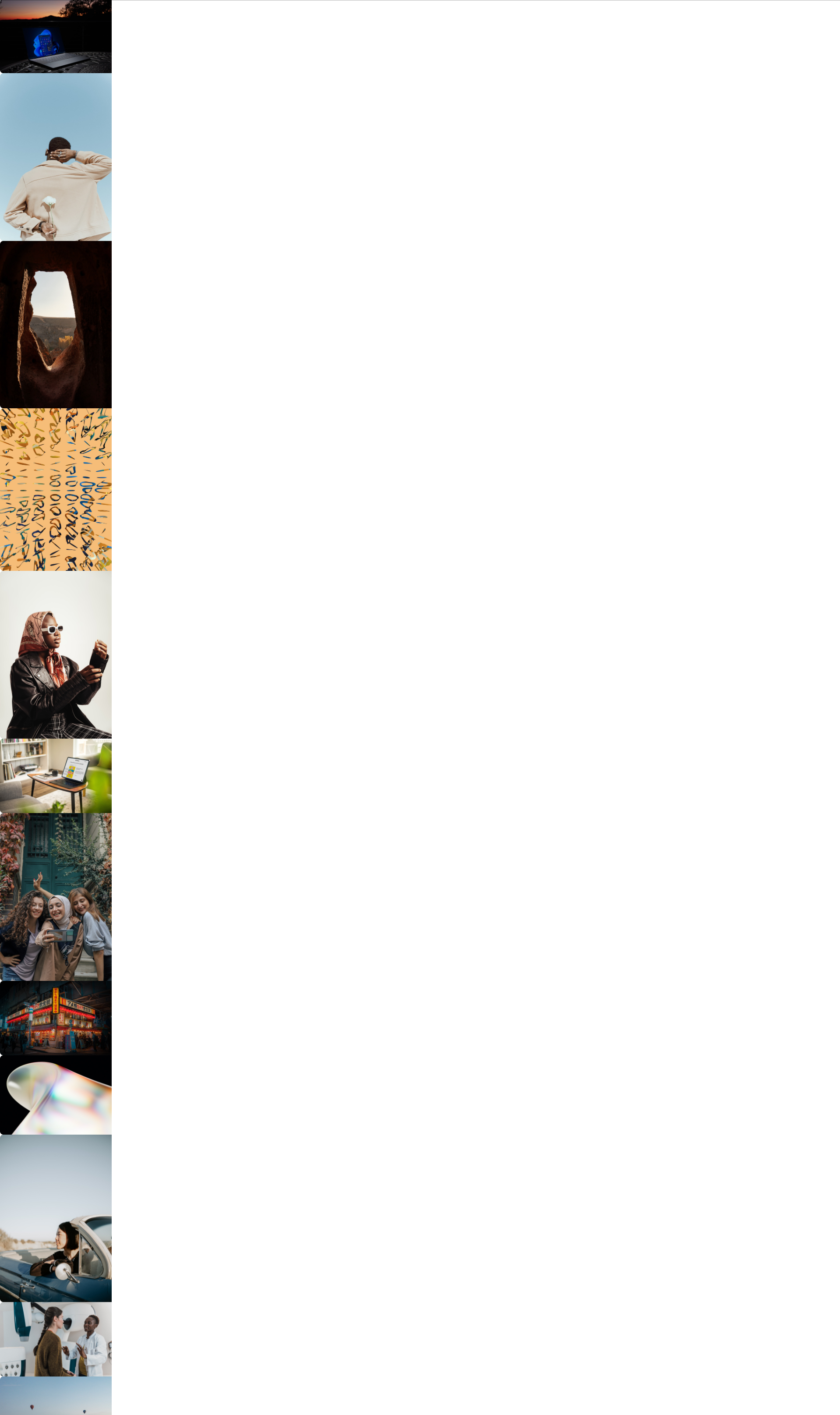
Now after we map the images they should lay normally like this.
And after we add the class of columns to the containing section of whole images, we will use a 7 column layout for this one, and after changing the code to
<section className='columns-7 max-w-7xl mx-auto space-y-4'>
        {photos.map((el) => (
          <div key={el.id} className='rounded-md overflow-hidden'>
            <img
              src={el.urls.regular}
              alt={el.description}
              height={300}
              width={200}
            />
          </div>
        ))}
</section>
We will see the layout work like magic with no extra work, we get a beautiful layout
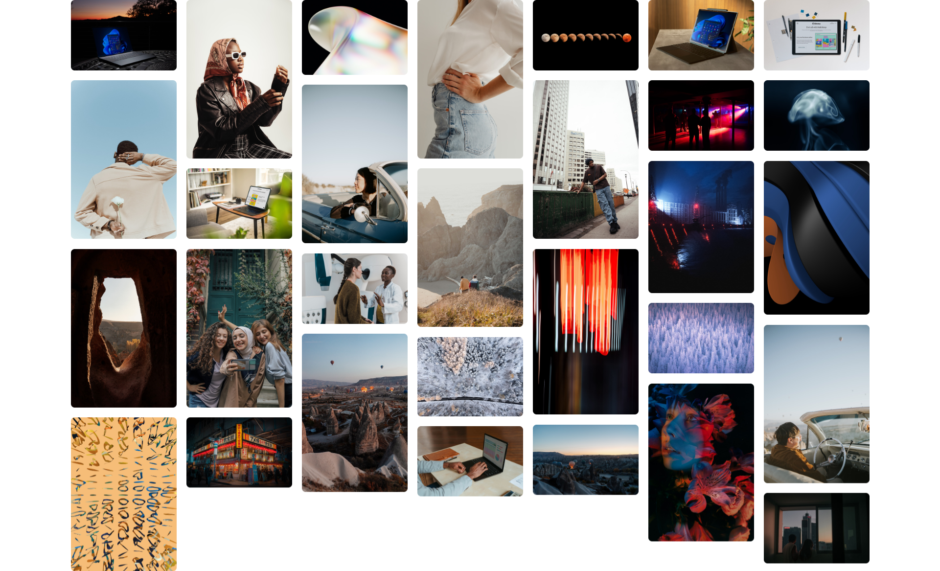
All right that's it, that is how we can achieve Pinterest like layout in a simple way using CSS columns, in next.js with Tailwindcss.
If you read all the way, thanks for reading the whole blog.
Any comments would be much appreciated.
About Me: My name is Sabin. I'm a full stack web developer and designer based in Pokhara, Nepal. I'm new to writing blogs and will continue to write hopefully 🤞. I focus primarily on the frontend with Next.js & React.js